-

-
Visual Art Submission Information
Visual Art Submission Guidelines
Focus in Artwork
Movement in Artwork
The Rule of Thirds
Snapshots vs Art Photographs
Image Size in Artwork
Taking a Photo of Visual Art
Top Mistakes To Avoid
Visual Art Submission Form
Main Submission Guidelines
General Mused Submission FAQs
Mused Contributor Bio and Photo
Calculating a Word Count
Proofreading Your Submission
Snapshots vs Art Photographs
A frequent question we receive from people new to photography is how a regular snapshot, the kind you find thousands of in every online photo gallery, differs from an artistic photograph. Just why is one person's 400 photos of the Grand Canyon different from the "one perfect shot" that gets published in National Geographic, in Newsweek, and in Mused? What is that unique aspect?The first thing to keep in mind is that photographs that grab and engage a reader tend to have all the High Quality Photograph Elements - including focus, movement, and balance. If you have not read through that listing yet, start there. For example, an image of wildflowers which is fuzzy due to camera shake probably won't interest people. A high quality photo needs to have those basics in place. A photo of small flowers generally should be taken with a macro lens and should be in sharp focus, unless a clear artistic point is being made.
So, that being said, let's start with a common theme - buildings. People love to take photos of interesting buildings when they travel. To see the full impact of these comparisons, it can really help to open two copies of this page and scroll so you can see the images side by side.
Here is a photo of a lighthouse taken by Donna Sciandra, which we ran in our Winter 2009 issue of Mused.
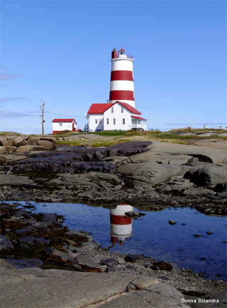
This image meets all the basic criteria of a great photo. It is well in focus. It has the image broken up into rough thirds to help the eye take it in. It has a sense of "movement" - your eye travels along the reflection. The shades of blue and textures of gray add depth to the image. The top is light, the lower in shadow. A viewer doesn't just glance at this photo and then move on. They are drawn in by the intricacies of the image.
Now, let's compare Donna's lighthouse with a snapshot photo I (Lisa Shea) took of the Quoddy Head lighthouse in Maine. This is the easternmost lighthouse in the US.
I didn't spend time setting up the shot, using a tripod, or checking the lighting and settings on my camera. I didn't pay attention to the focus or do 100 different shots with different angles. Heck, I didn't even wait for the people on the path to get out of the way! I just pointed, clicked, and walked on.
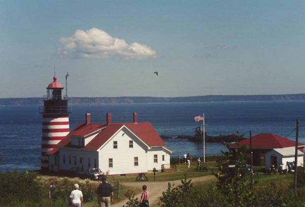
You can see all of those issues in the resulting photo. I'm not saying it's a "bad" photo - any more than all the millions of snapshot photos on the web are "bad"! It's not at all that they are bad. It is just that they are not stellar. So what would I have wanted to work on, for this photo, to polish it to the point of stellar-hood?
First, the color is washed out and the image is not quite in focus. Having an in-focus image is really important. It literally gives people headaches to try to look at an out-of-focus image, which does not lead to a positive viewing experience.
I do have the "rule of thirds" in place here, with the sky, sea, and ground forming those thirds. However, everything is skewed over to the left side. You have the lighthouse, the clouds, and even the bird all taking up the left. In comparison the right just has a little hut and some distracting power lines.
The black spot of a bird in the middle draws the eye, when the lighthouse should be what people are looking at. In addition, the people in the foreground distract you from the main image. If they weren't there, then the path might have given you some sense of "motion" which is key in an image. Even better, though, I should have backed up some more. I could have had a nice path leading to the lighthouse, and then the lighthouse itself taking up most of the image, with the flag on the far right. That way the image would have had balance. I should have waited for the people to leave so that the focus of the image was the lighthouse. I should have tweaked the camera's settings so the image was *in focus* and so the colors came through more vibrantly and naturally. Some patience would have allowed the clouds to move across into a perfect position as well!
Out of curiosity, I took 10 minutes in Photoshop to show what might have happened. This might have been the scene if I'd simply taken a few more minutes at the location and waited for the foreground people to move, for the cloud to move, while setting up a better shot with a tripod. Here is a rough guess at an end result.
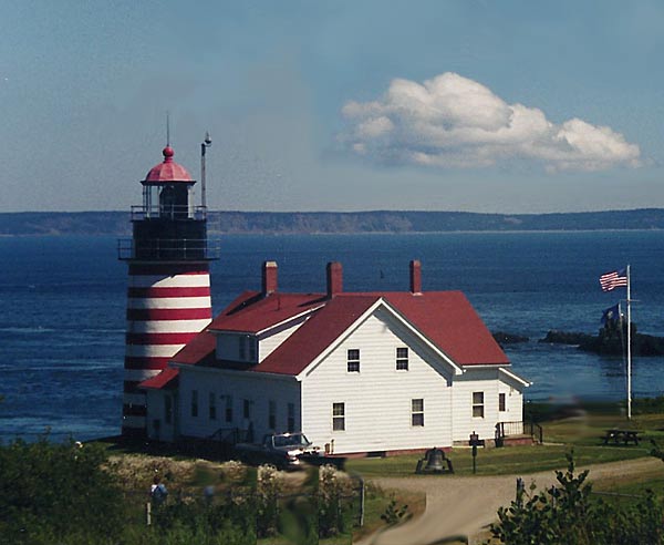
Even that "quick fix" is much better than the original! If you look at the two images side by side (with two browser windows) you can see how the second one draws in a viewer. The focus is clearly on the lighthouse, not on bird-spots or random people. The image is much more crisp and full of natural color. The balance with the high lighthouse on the left and the cloud on the right works better. You get a sense of motion with the sweep of the road and the movement of the flag (although it would have been much better with the longer road leading in).
The keys to a best-of-best photo come down to patience and knowing your camera well. You should know how it handles focus and colors at different speed and apeture settings. You should carry a tripod and be willing to use it. You should be ready to take 100 photos, from different angles. Sometimes your building might have a giant protrusion of trees on one side, which ruin the balance. Simply by shifting 20 feet to the left, you turn a so-so shot into a beautifully proportioned image.
Yes, some things are out of your control. Clouds drift where they want to drift. Crowds of people come and go. Let's say you wait and wait, and come back on different days, but you just can't get a certain troublesome item to change. In cases where you are completely stuck - let's say there is a row of power lines across an image which are completely distracting - this is where PhotoShop comes in. This helps you tweak your artistic creation to have the desired impact with your readers.
So let's take this image of a vineyard in Rhode Island, which I (Lisa Shea) took.
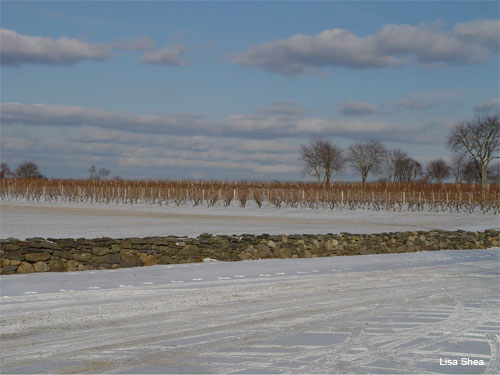
The aim here was for an image with muted colors, subtle shades in wintry themes. The "movement" of the eye was on the lines of the bare vines intersecting with the layered fieldstone wall. I was aiming for a French painting look to the image. I liked the striped clouds mirroring the vines, the natural thirds of the landscape, the subtle shades of gray in the snow, the clouds, and the stones.
However, take a look at the original photo I took.
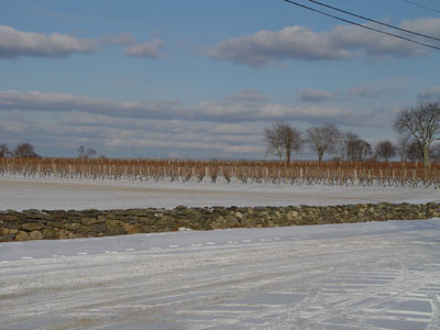
You can see how distracting those glaring black power lines were in the original photo! They immediately drew the eye. You always want to control what "grabs attention" in any image you present to a viewer. The power lines were NOT what I wanted the focus to be, and they therefore had to go. I used PhotoShop to remove them, and the picture as a result became the image I wished to present.
If I had been even MORE patient, I would have stood there all day - and waited for just the exact right time when the sun hit those vines and caused them to glow. That would have been one of those one-in-a-thousand shots.
To summarize, there is only so much you can "fix" with Photoshop. That is why patience is key. The photographs on the cover of National Geographic weren't one-time shots by a casual drifter. Usually they are one of a thousand images a person determinedly took over the course of several weeks (or months), changing camera settings, watching the natural light, waiting for people to move, always ready for that one perfect moment. It is that patience and persistence and diligence which creates a work of art!
Visual Art Submission Guidelines
Focus in Artwork
Movement in Artwork
The Rule of Thirds
Snapshots vs Art Photographs ← You Are Here
Image Size in Artwork
Taking a Photo of Visual Art
Top Mistakes To Avoid
Visual Art Submission Form
