-

-
Visual Art Submission Information
Visual Art Submission Guidelines
Focus in Artwork
Movement in Artwork
The Rule of Thirds
Snapshots vs Art Photographs
Image Size in Artwork
Taking a Photo of Visual Art
Top Mistakes To Avoid
Visual Art Submission Form
Main Submission Guidelines
General Mused Submission FAQs
Mused Contributor Bio and Photo
Calculating a Word Count
Proofreading Your Submission
How to Take a Photo of a Painting / Drawing / Visual Work
Mused would LOVE to run more paintings, drawings, watercolors, and other visual work in our issues. The primary reason we have so few of those types of items in our issues is that the images submitted to us suffer from a multitude of photography-based flaws. Here are the problems that we see, and here is how to fix them.REMOVE ALL CLUTTER
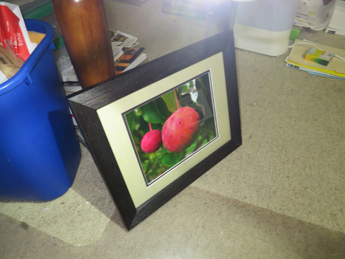
Take a look at this photo of a framed work of art. Imagine that this photo is of an oil painting of Korean Dogwoods, which is mounted in a frame.

This photo above (table leg and all) is the type of photo-of-painting submission we often get to Mused. There is often a wealth of clutter in the background of the photo. There should not be ANY clutter in your photo. Your photo is striving to be the best possible representation of that work of art. The only thing visible in that image should be the work of art itself.
Move around with the camera until the camera sees the work of art - and nothing else. If for dimensional reasons that would be impossible, take the picture with as little excess background as possible in it. Then use Paint, Photoshop, or another tool to "crop" the image so that only the artwork itself is in the final image. If you don't know how to use these programs, talk to friends and family. Surely someone knows how to help. If you really can't find anybody, talk with us. We'll explain how to do it. However you do it, it's absolutely critical that the file submitted to us have the work of us - and nothing else - shown in it.
TAKE THE PHOTO HEAD ON
Look again at the photo above. It was taken at an angle to the Korean Dogwood image. That causes the image to be slanty and have an odd perspective. It's critical that your photo of your artwork be taken head on at a perfect 90 degree angle. That way there is no skewing or twisting of the image. Your viewers want to see the true beauty of your work of art - not a version that is twisted and tormented.
USE GOOD LIGHTING
In the above example, there is light flare which distorts the image. You can't see its true colors or shapes because of that light. We get submissions with flash glare, lens flare, and other issues. All of those distract from the artwork itself. Do your best to control for those issues. Turn off your flash. Set up lights which are not pointing directly on the artwork.
Here is what we are looking for, when we get an artwork submitted:

We want just the artwork item itself, in a proper proportional representation, without glare or flare or other visual artifacts.
If you are having trouble achieving this with your painting, watercolor, or other artistic item, let us know. We'll do our best to help!
Visual Art Submission Guidelines
Focus in Artwork
Movement in Artwork
The Rule of Thirds
Snapshots vs Art Photographs
Image Size in Artwork
Taking a Photo of Visual Art ← You Are Here
Top Mistakes To Avoid
Visual Art Submission Form
